From LEEDuser to Greenuser
Brand Identity · Platform Strategy · Creative Direction · UX Strategy · Information Architecture
LEEDuser had spent years earning its authority. Founded in 2009 as a technical support forum for LEED practitioners, it had grown into a trusted resource for thousands of sustainability professionals, a place to find answers, navigate certification complexity and engage with others working through the same challenges. As the platform expanded to support a broader range of sustainability certifications beyond LEED, a more fundamental rethink became necessary: a new name, a new identity, and a rebuilt platform experience.
Studio Black Iris led that transition from the outset: the strategic and creative work behind what became Greenuser. The challenge was twofold. The platform and brand identity needed to modernise and grow, expanding the architecture to support new certification frameworks and functions. But it also had to stay familiar to the community that already relied on it, more capable without becoming more complicated.
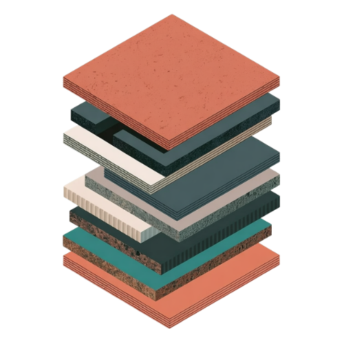
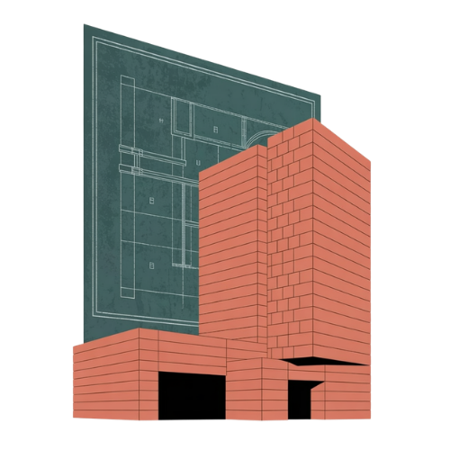
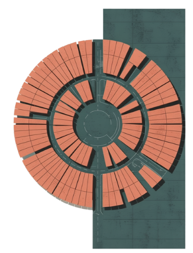
We approached the evolution by balancing continuity with expansion. The identity direction moved deliberately away from the leaf motifs and green-tech aesthetics the platform had long carried, drawing instead from architectural logic, modular systems and spatial organisation, closer in sensibility to the built environment profession it serves than to the branding conventions of the industry surrounding it.
The UX thinking had to account for a platform originally structured around a single certification system that now needed to support several. That meant rethinking the information architecture from the ground up, expanding and reorganising resources, forum categories and accreditation pathways to accommodate WELL, SITES, Green Globes and other frameworks alongside LEED, without the platform losing coherence or becoming harder to navigate.
The focus was making that accumulated depth easier to move through: clearer wayfinding, improved knowledge discovery and a more contemporary discussion experience that better reflected how professionals actually engage with one another online. Community participation features including expert profiles, visible credentials, direct messaging and more usable threaded discussions were designed as part of the platform's broader evolution, creating more room for peer-to-peer exchange and ongoing professional dialogue within the platform itself.
Beyond the core platform, supporting pages and membership experiences helped articulate the platform's broader value and give the new identity room to carry consistently across the experience as a whole.
Our contribution spanned brand strategy, creative direction, UX thinking and product design, alongside implementation oversight during development, reviewing implementation quality, documenting UX and visual inconsistencies, refining interaction details and bridging the gap between design intent and execution across the evolving platform. The work was delivered ahead of launch, with the platform still in development.