A New Editorial Identity for BuildingGreen
Brand Identity · Creative Direction · Editorial Design · Visual Systems · Graphic Development
Following its acquisition by architectural consulting firm Above Green in 2024, sustainable building publication BuildingGreen entered a new phase of evolution. The platform had built decades of credibility through its educational content and article-based publishing model. Alongside a broader brand refresh, a new editorial offering was introduced for paid subscribers, a themed issue format that would sit alongside the existing platform as a more immersive, contemporary form of content. Introducing that to a readership with a long relationship with the brand required as much care as the creative work itself.
Studio Black Iris shaped the creative direction for the first three issues, developing the visual language, editorial system and graphic character that would carry the new format across each release. The work extended BuildingGreen's identity into a new kind of experience, one capable of holding the depth and cultural weight of conversations happening across sustainability, architecture and the built environment.
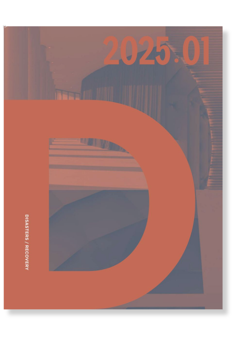
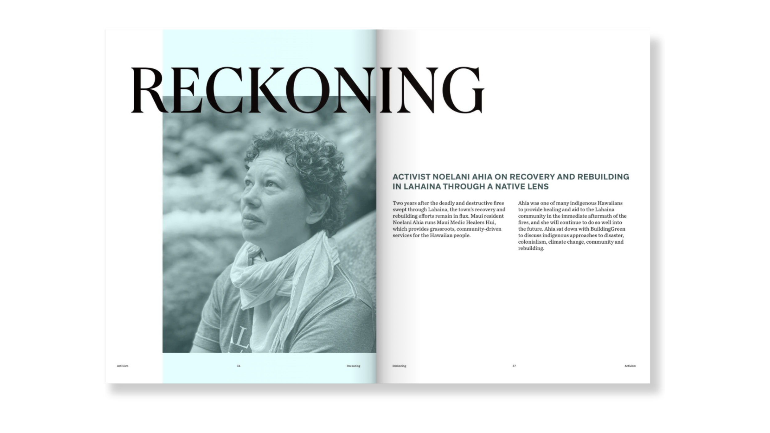
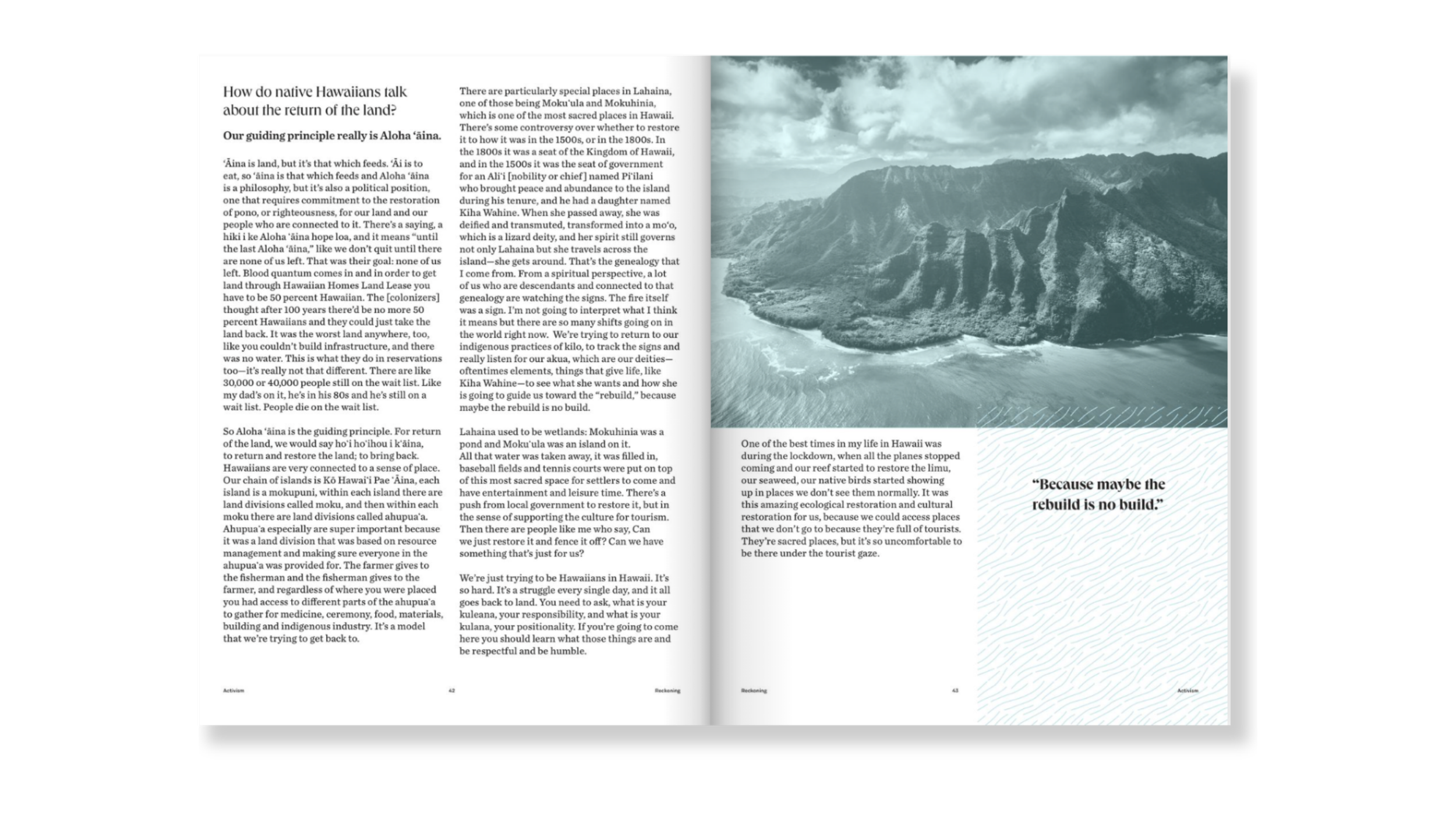
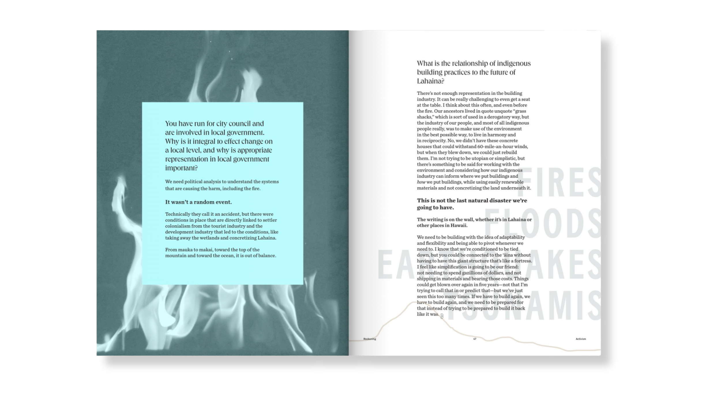
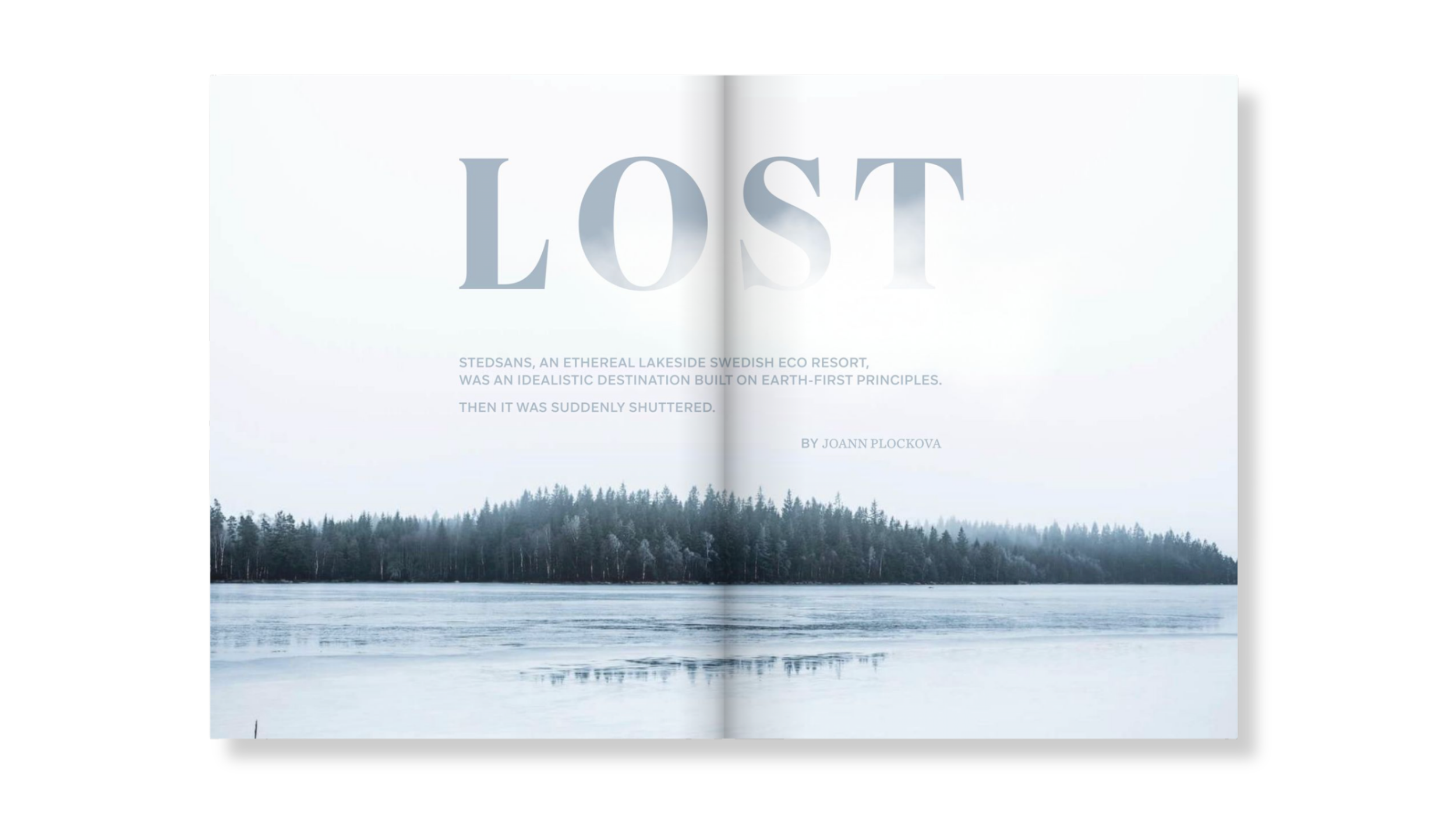
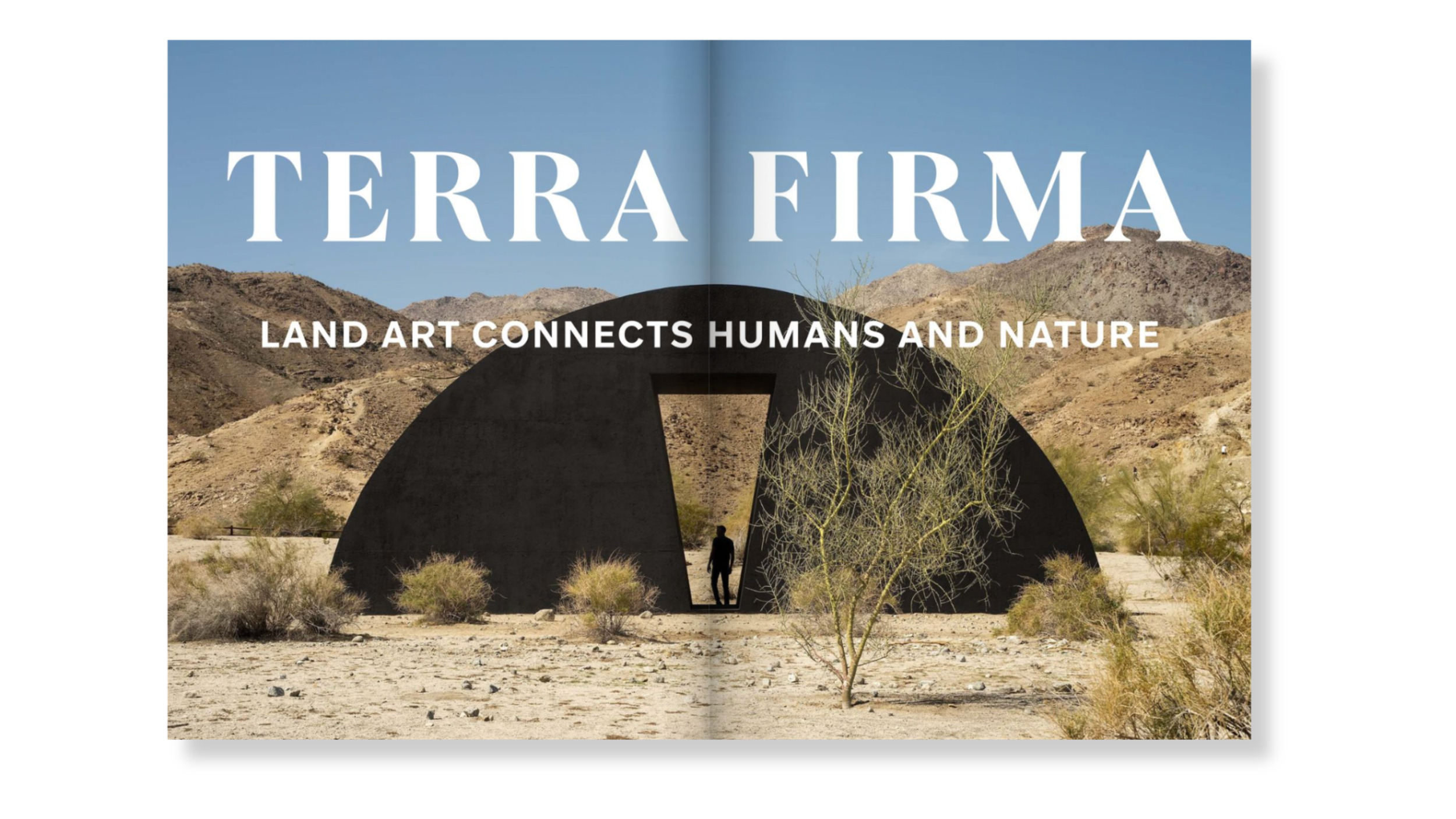
Issue 1 | Disasters and Recovery
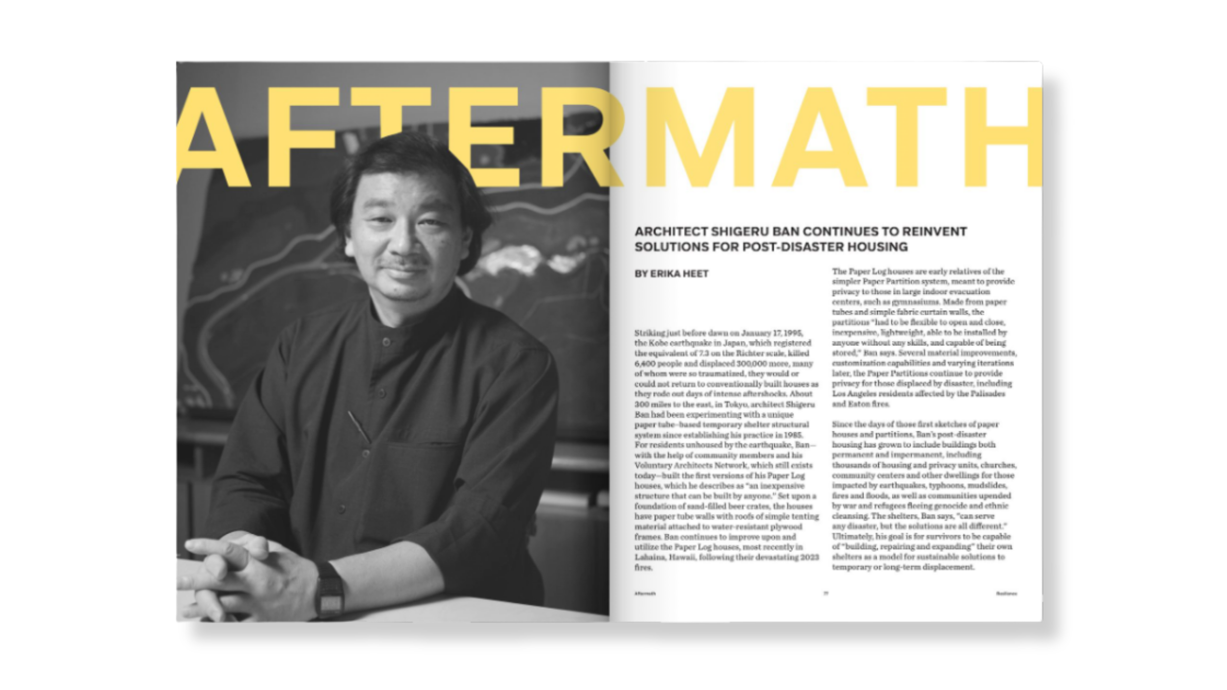
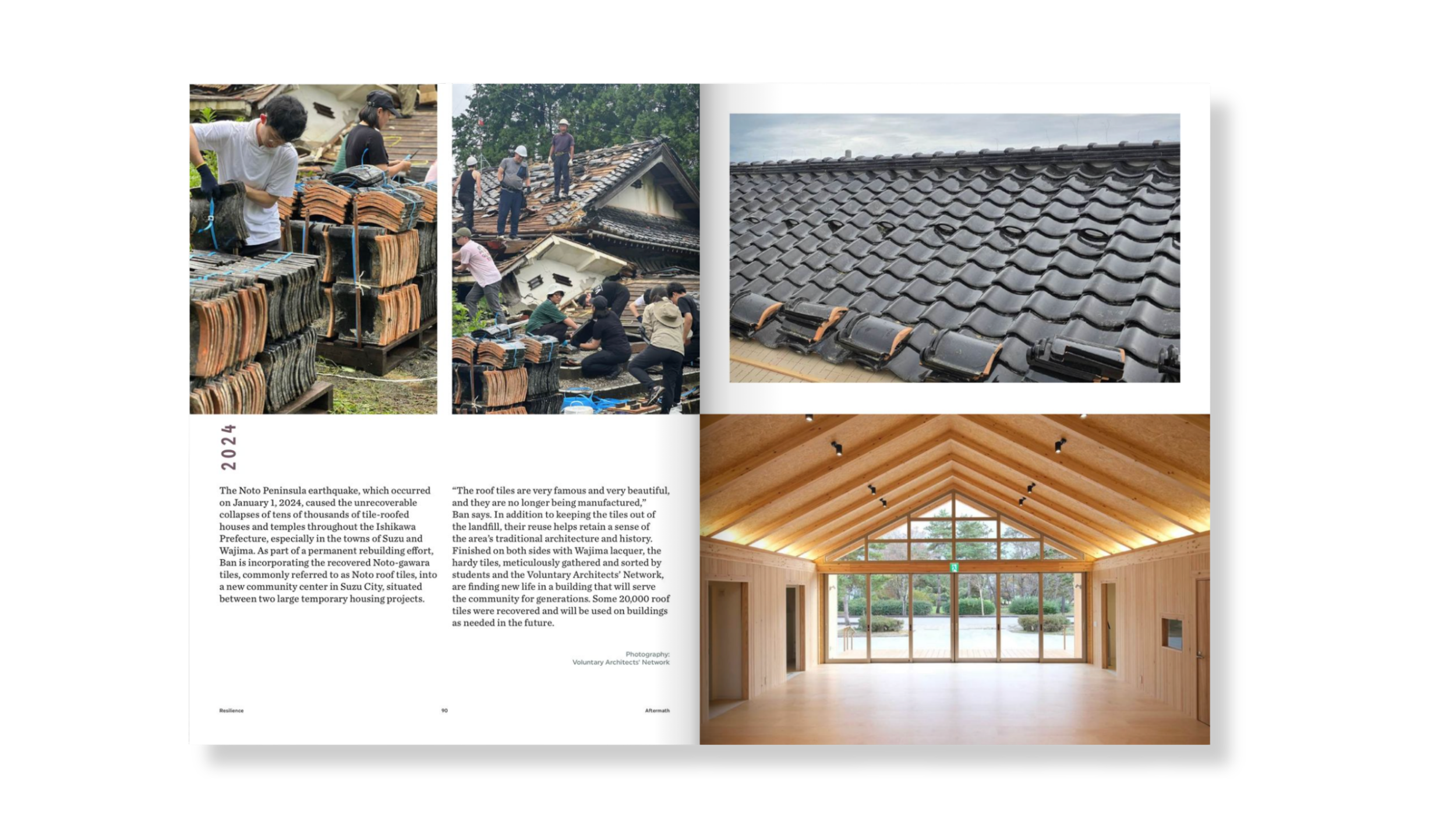
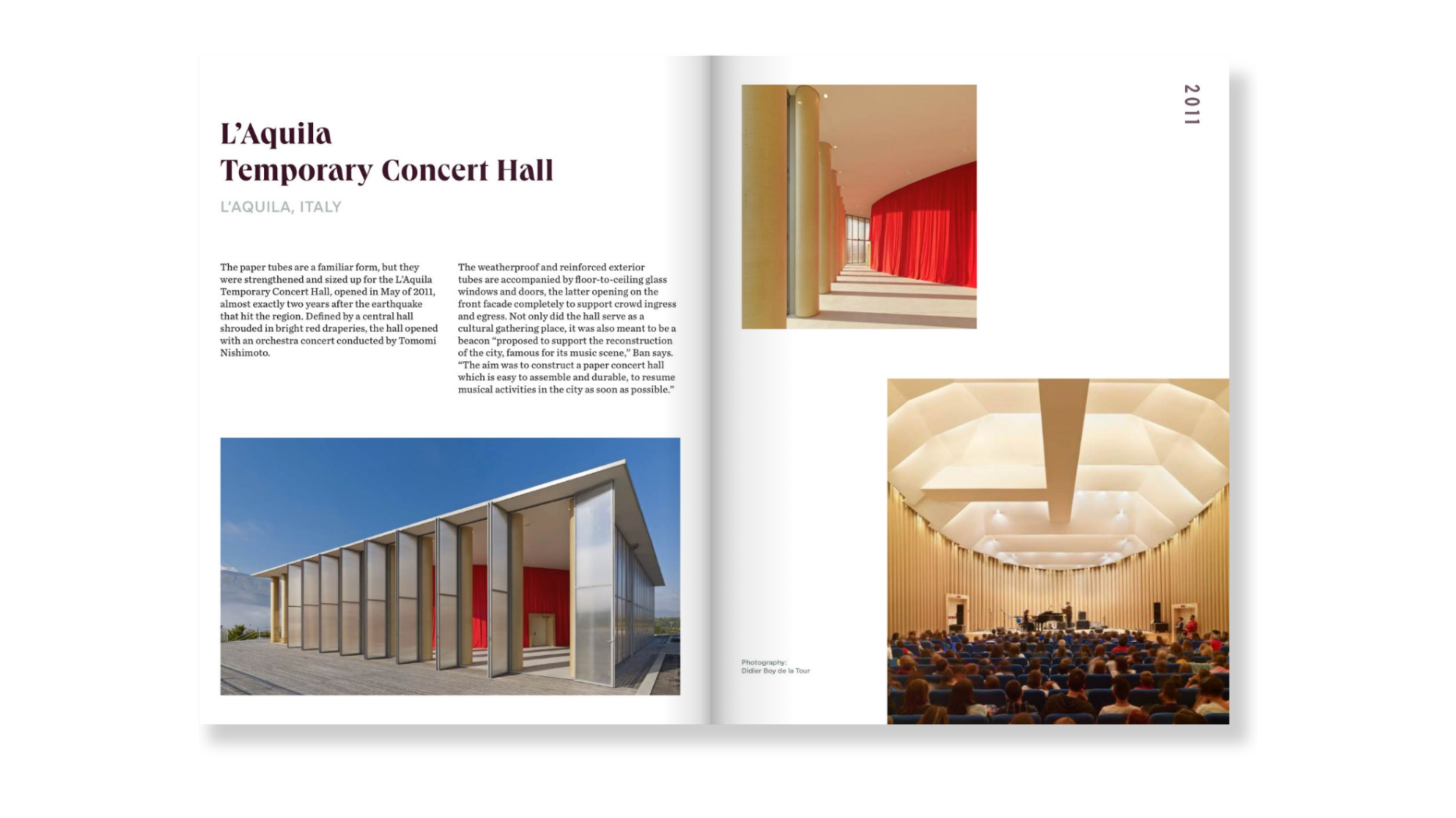
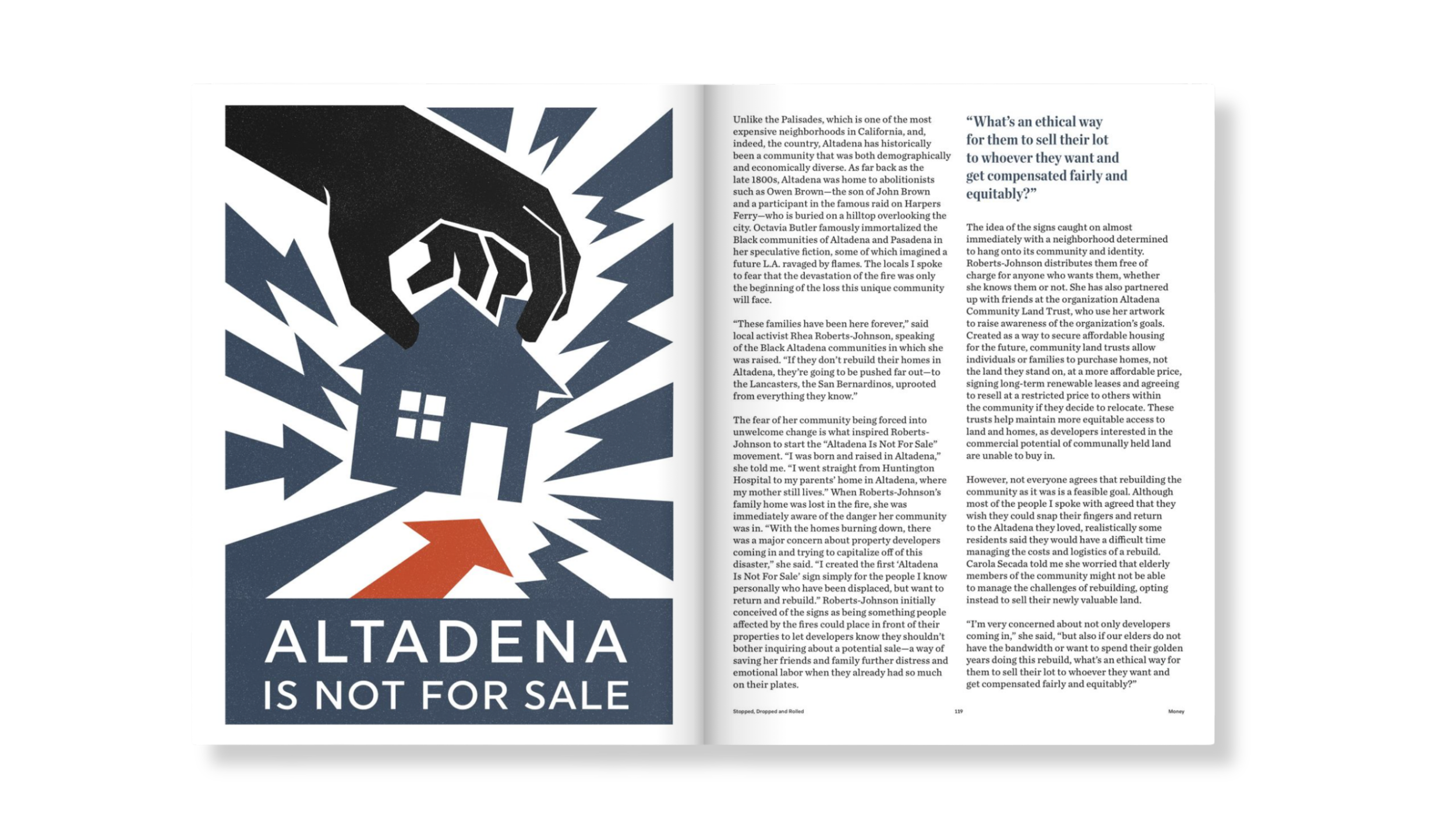
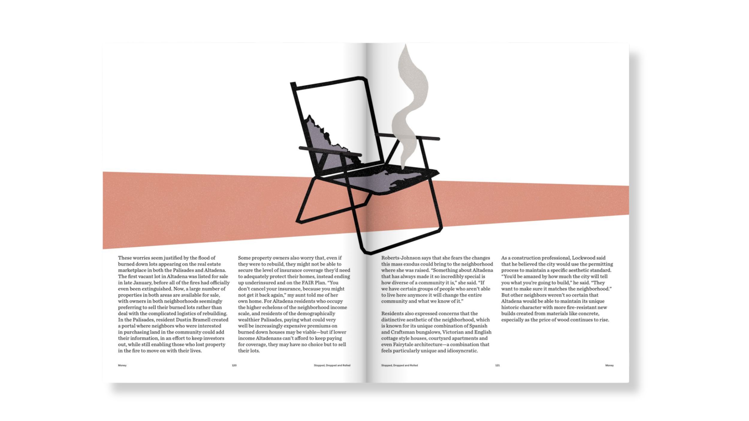
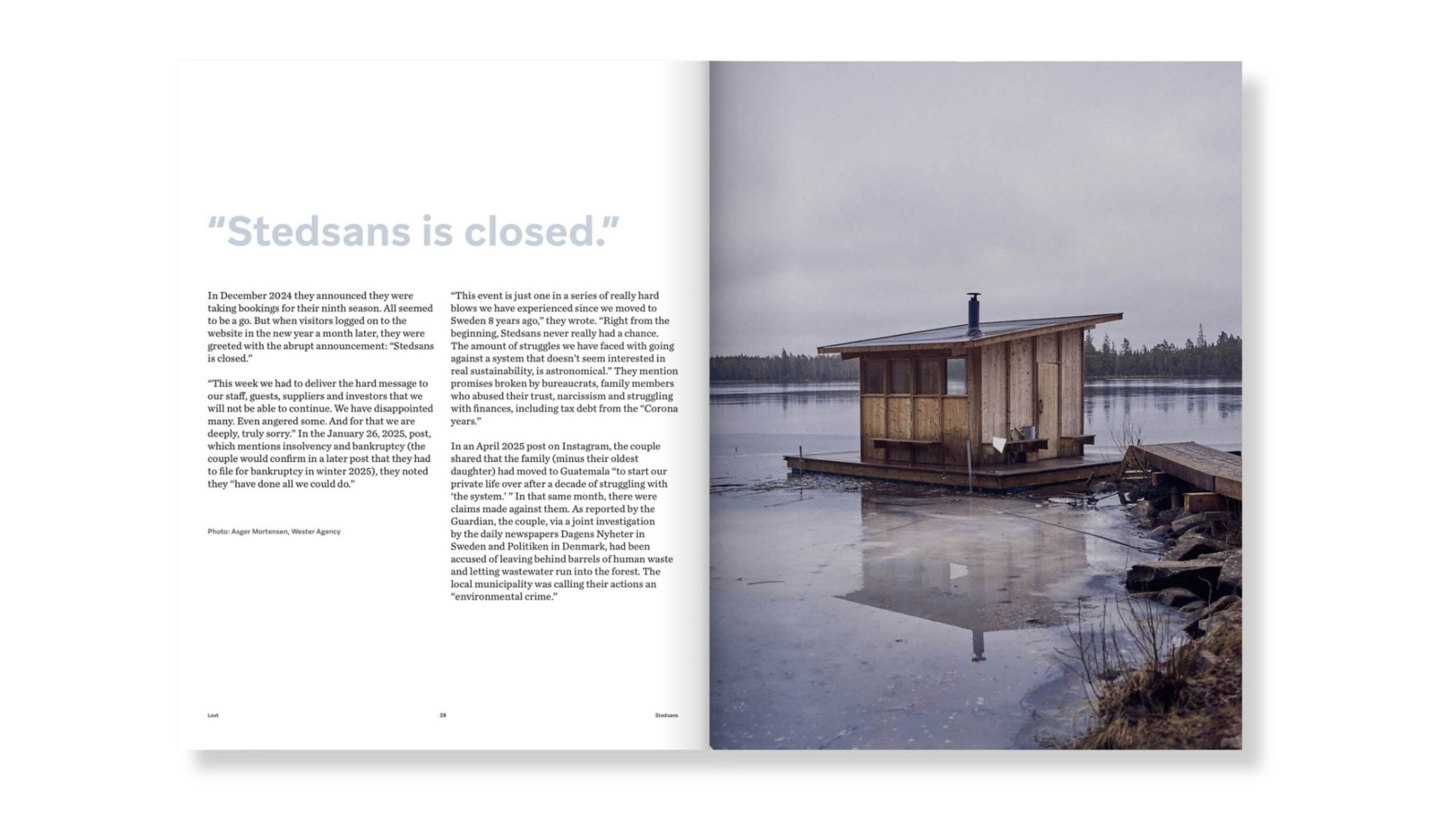
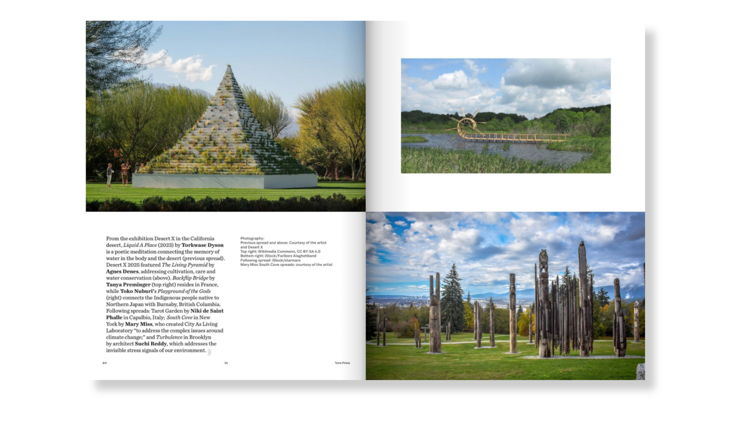
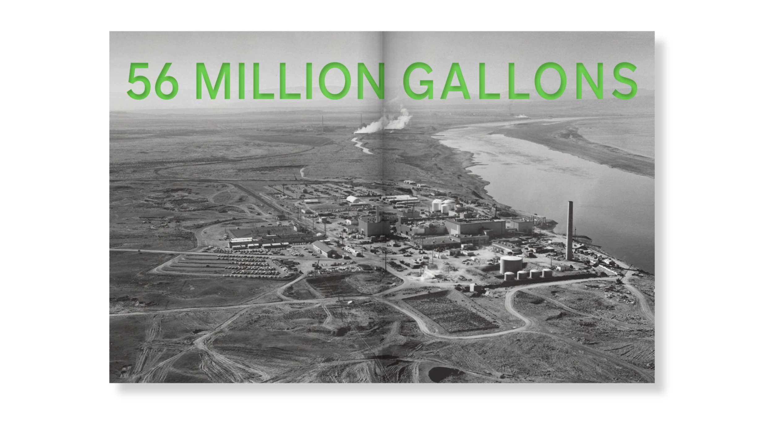
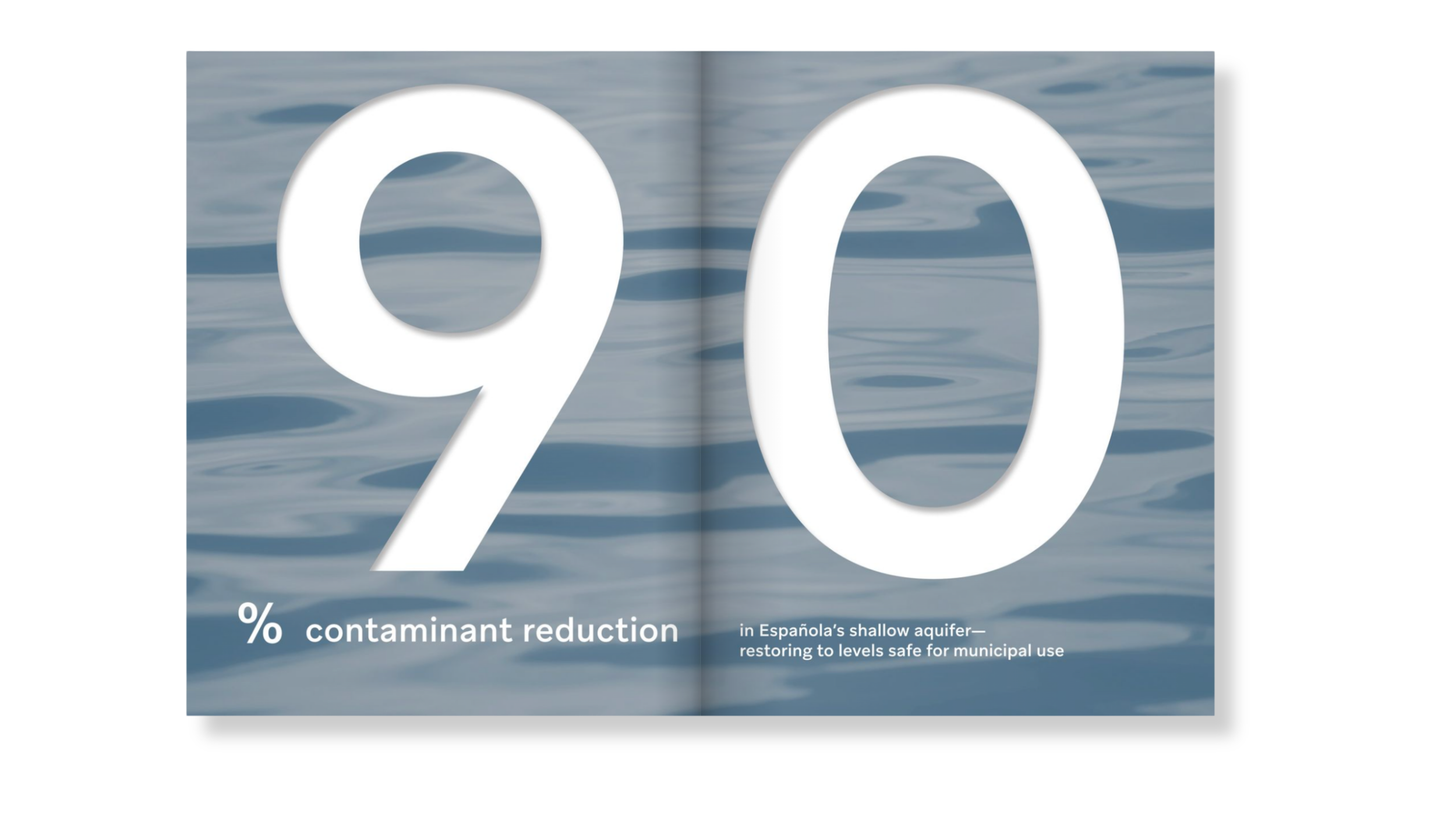
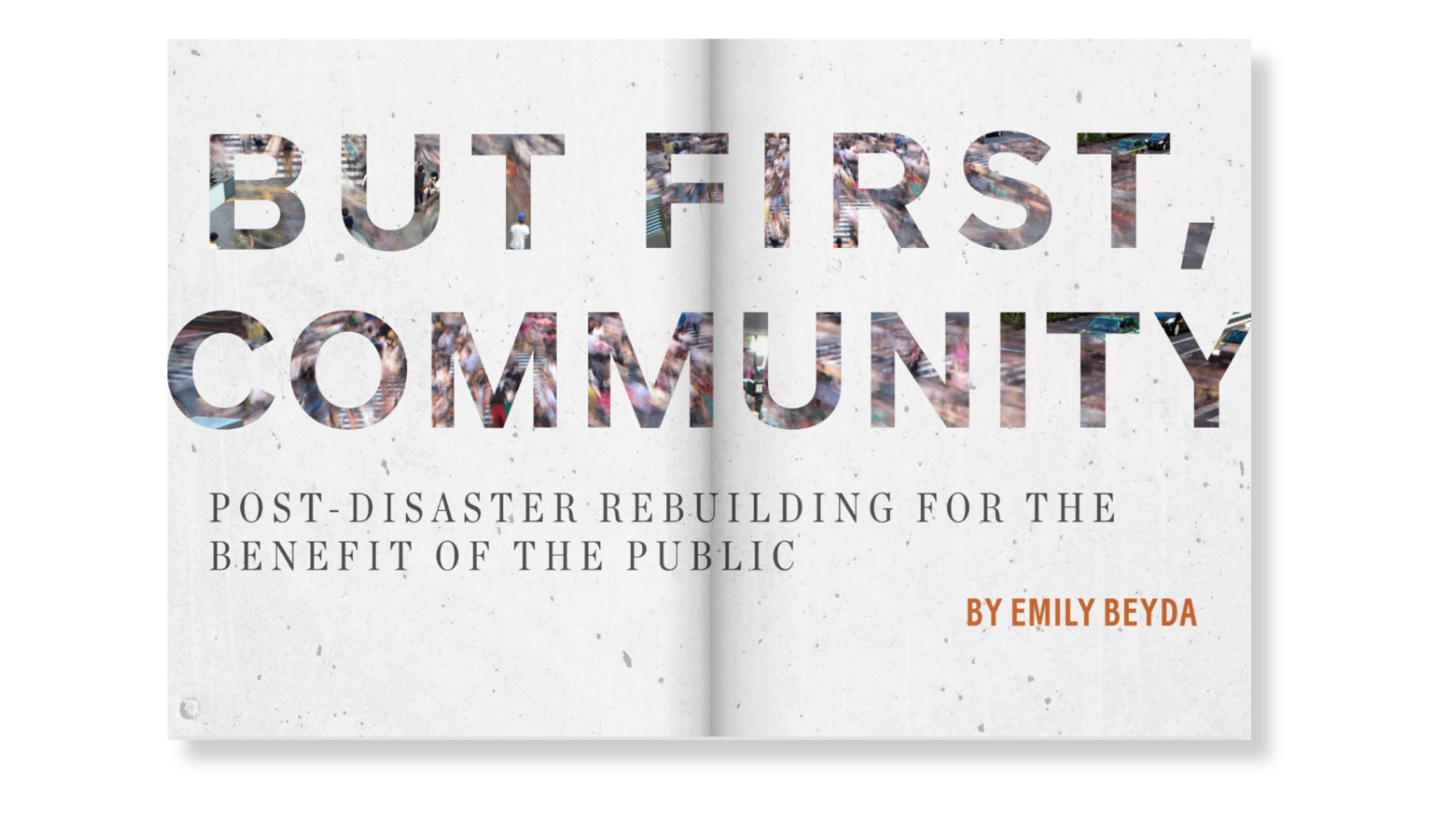
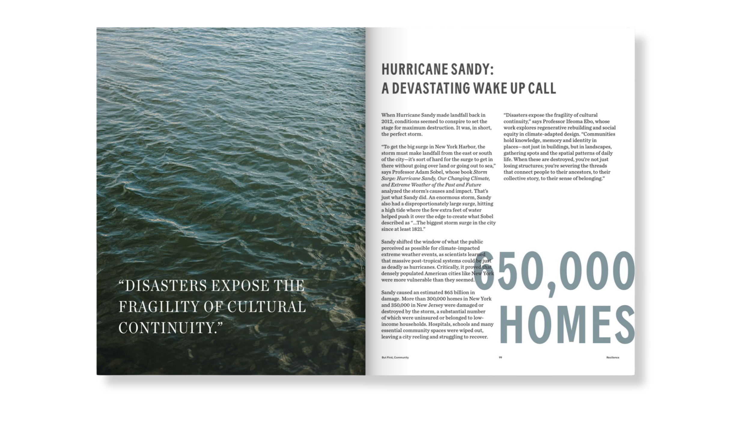
Disasters / Recovery set the tone for the publication, measured and documentary in character. Photography ran large, spreads breathed with generous margins and the graphic system stayed close to the content rather than competing with it. The restraint was deliberate: a theme carrying the weight of loss and devastation needed space to land. The first issue also needed to earn trust before it could take risks.
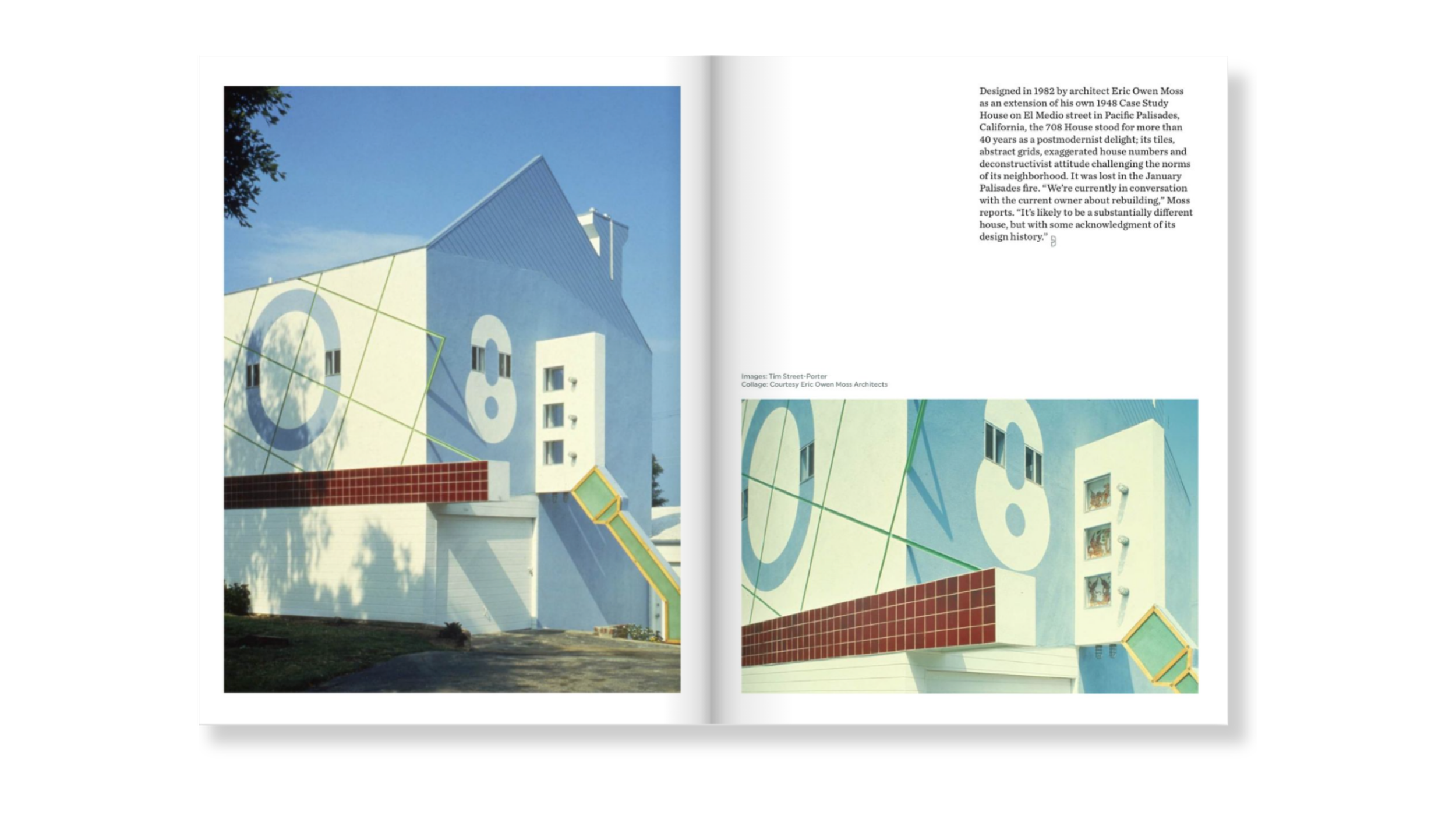
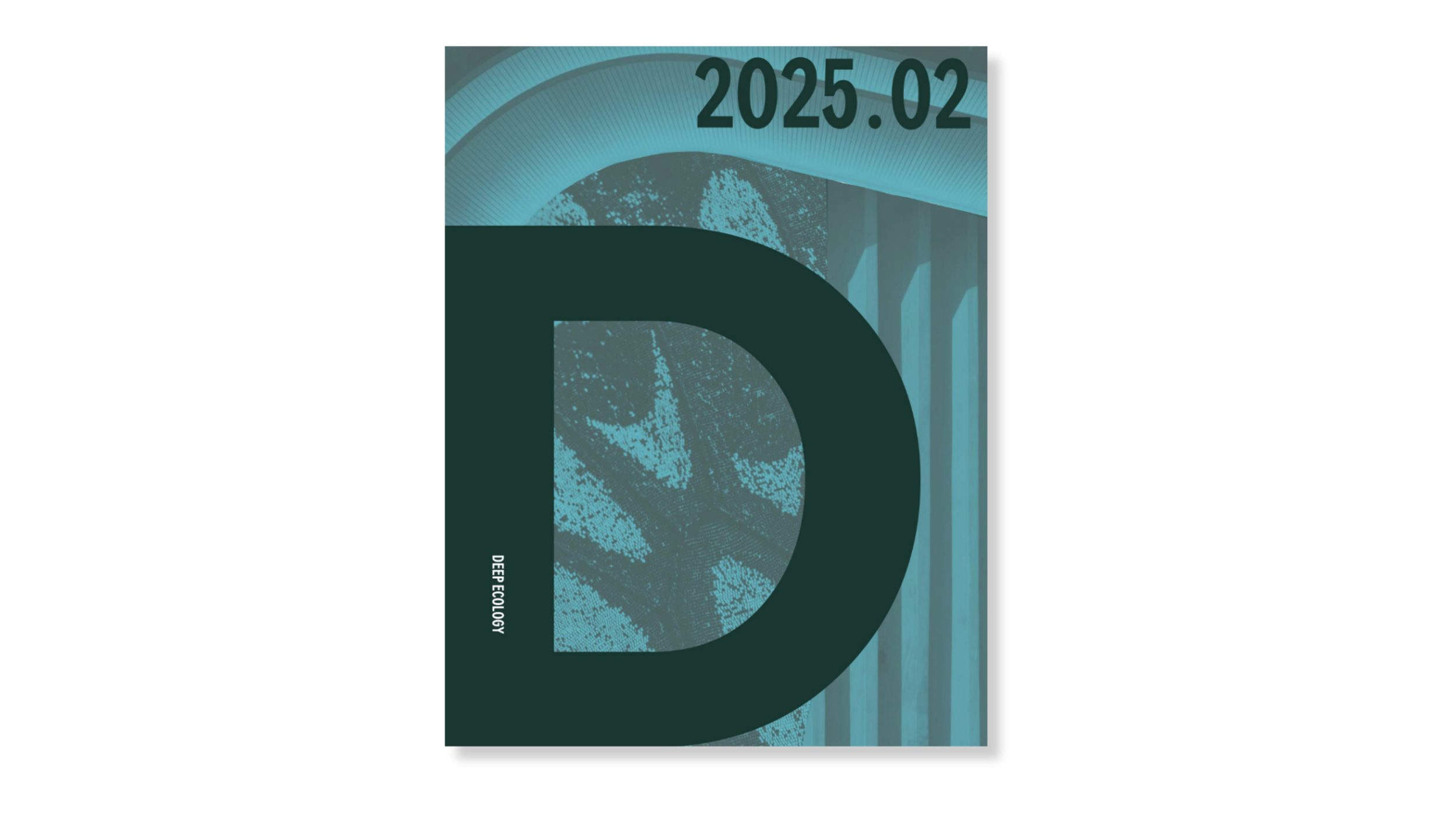
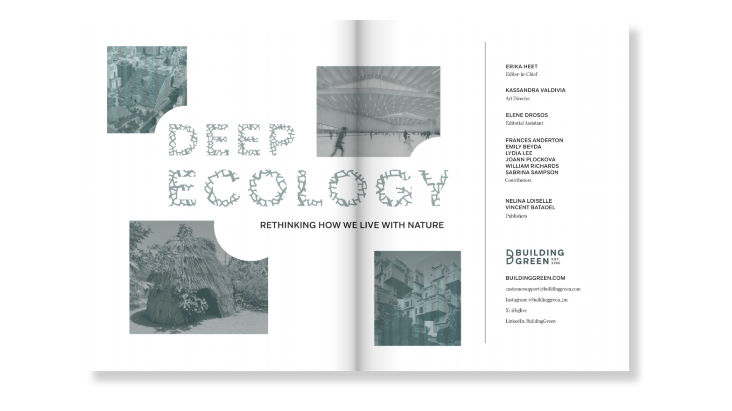
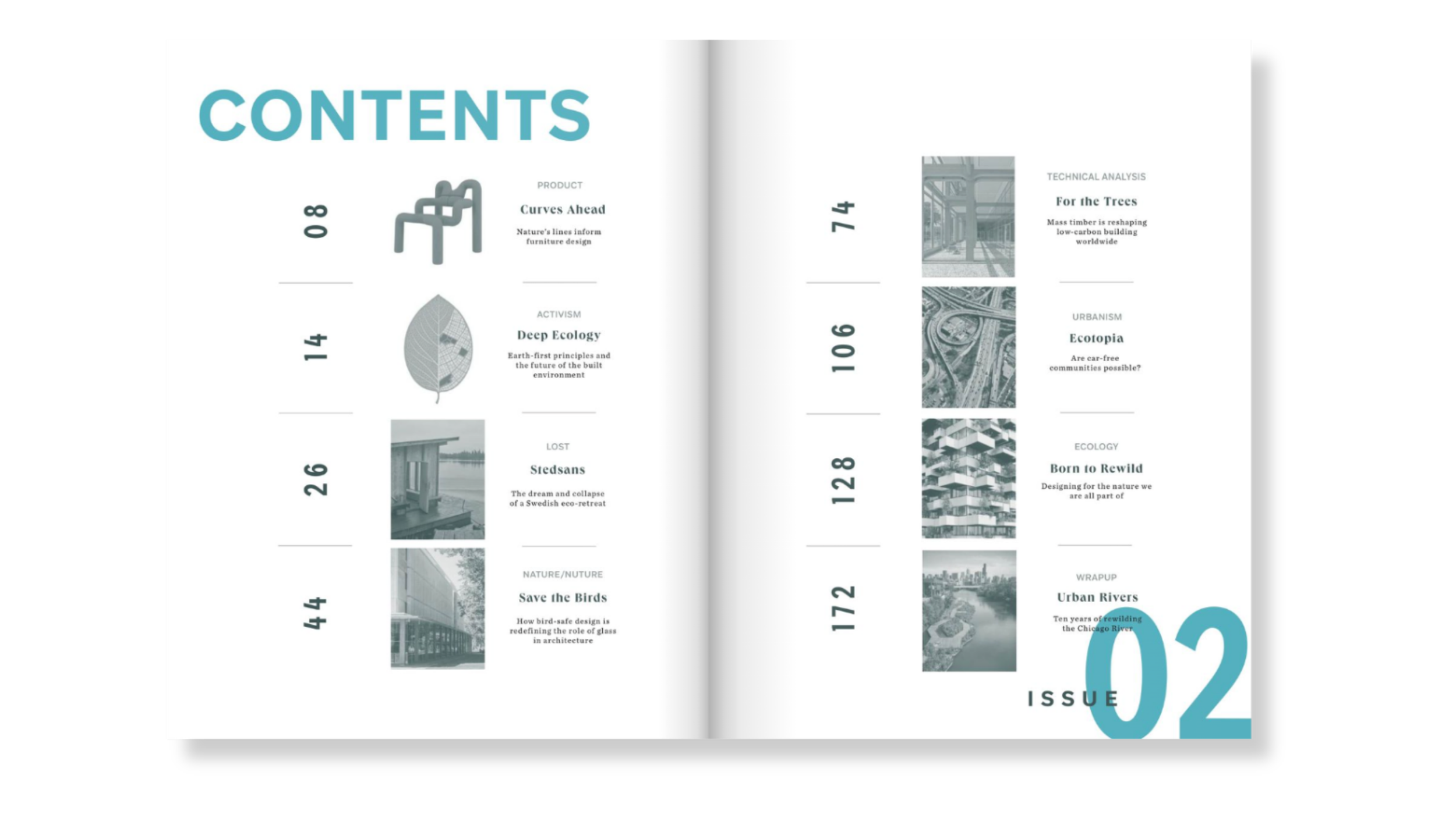
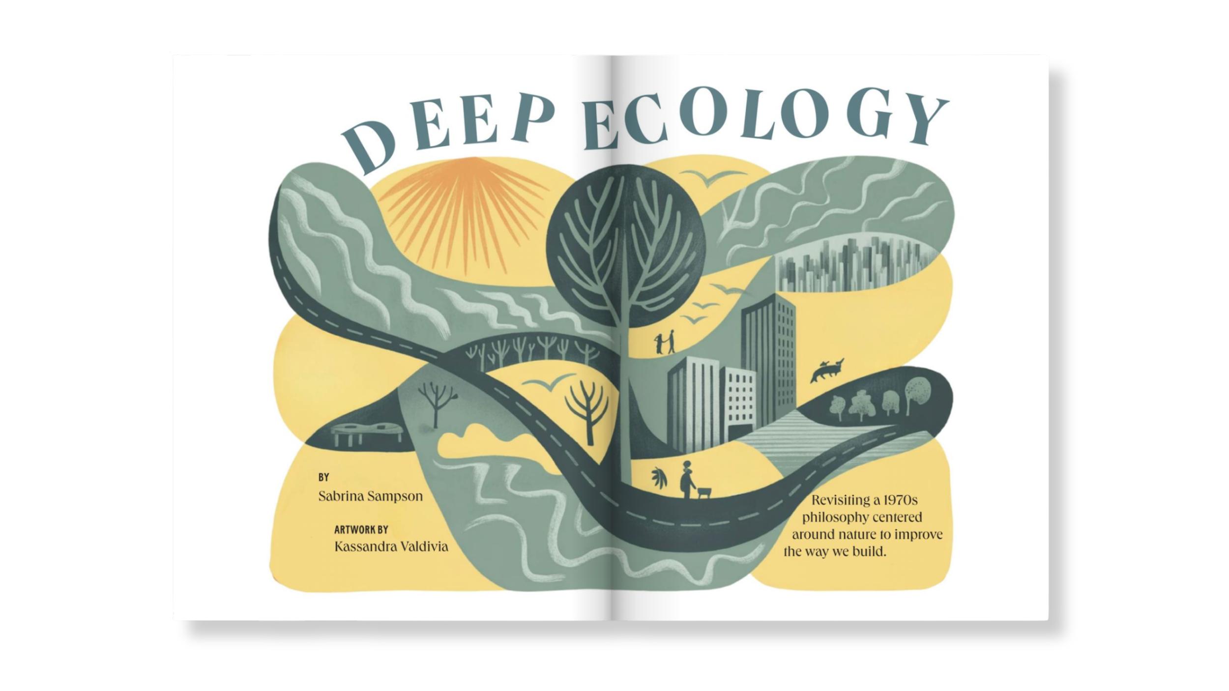
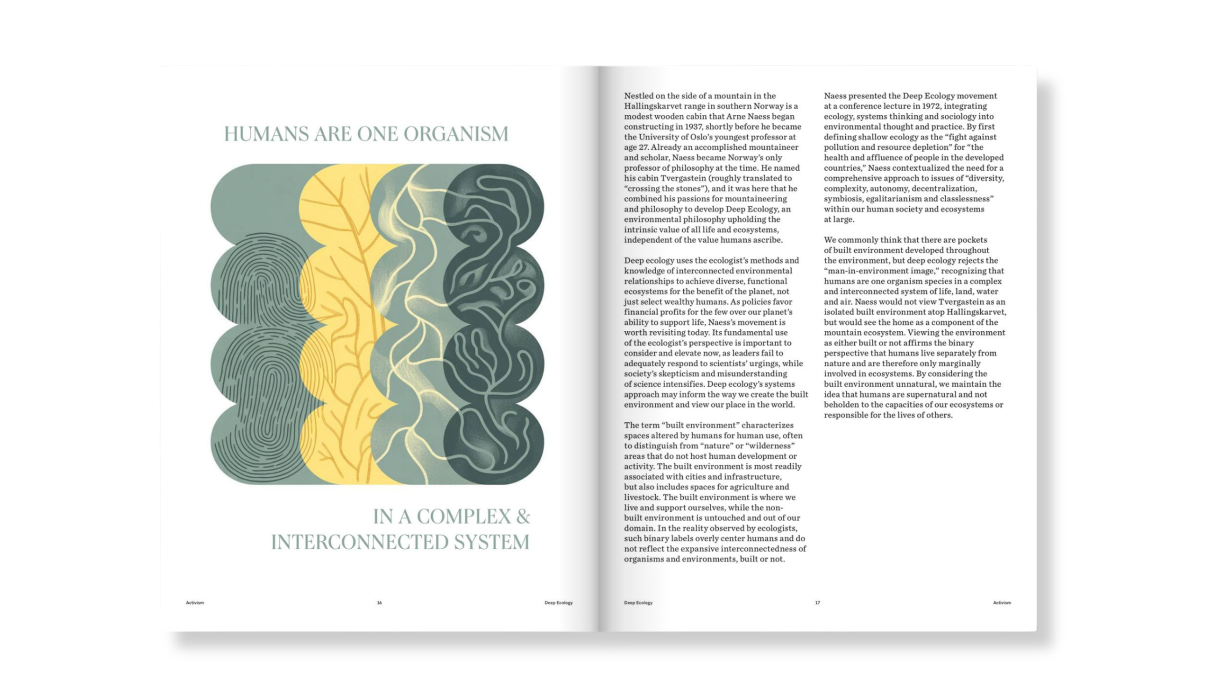
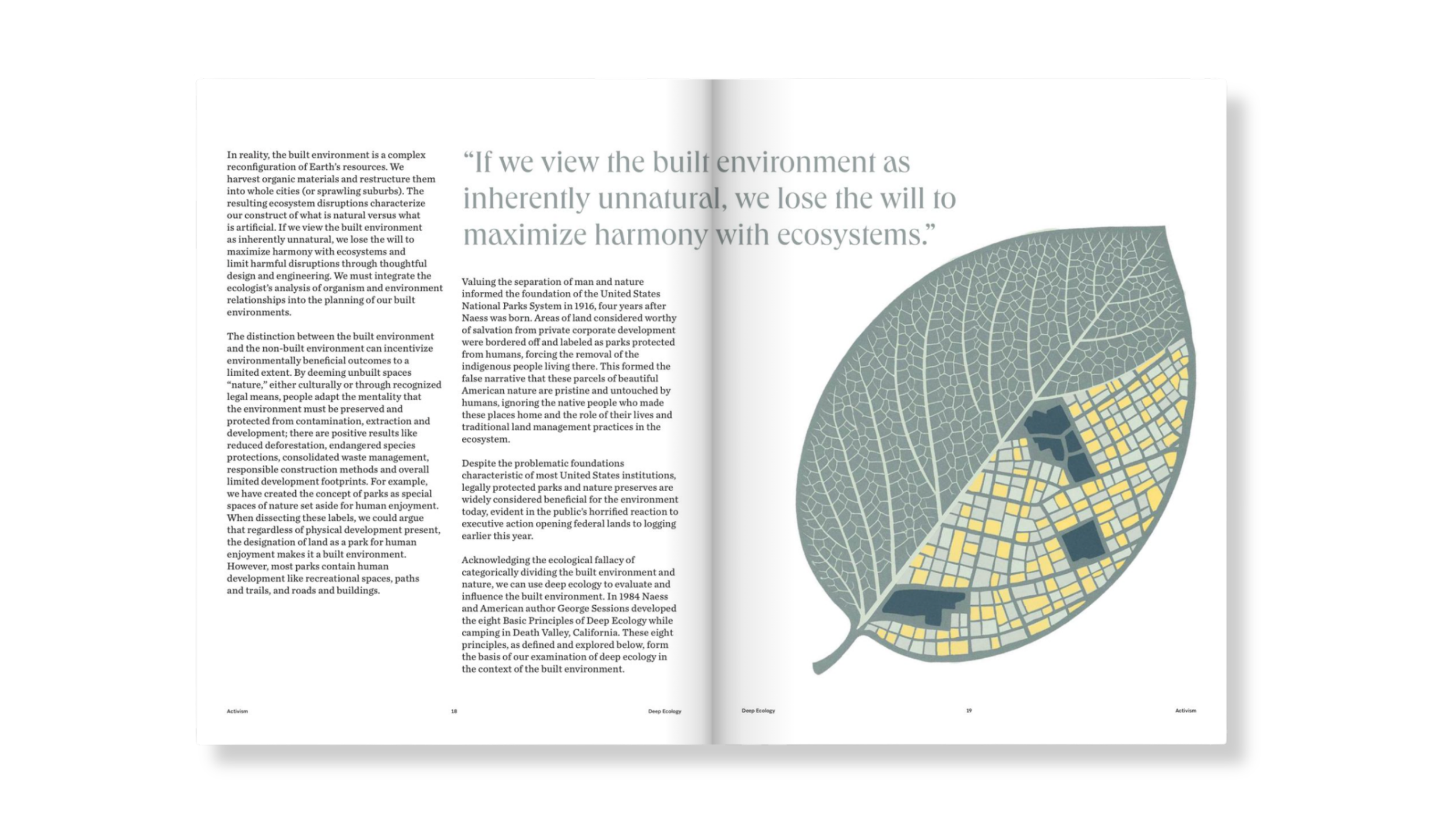
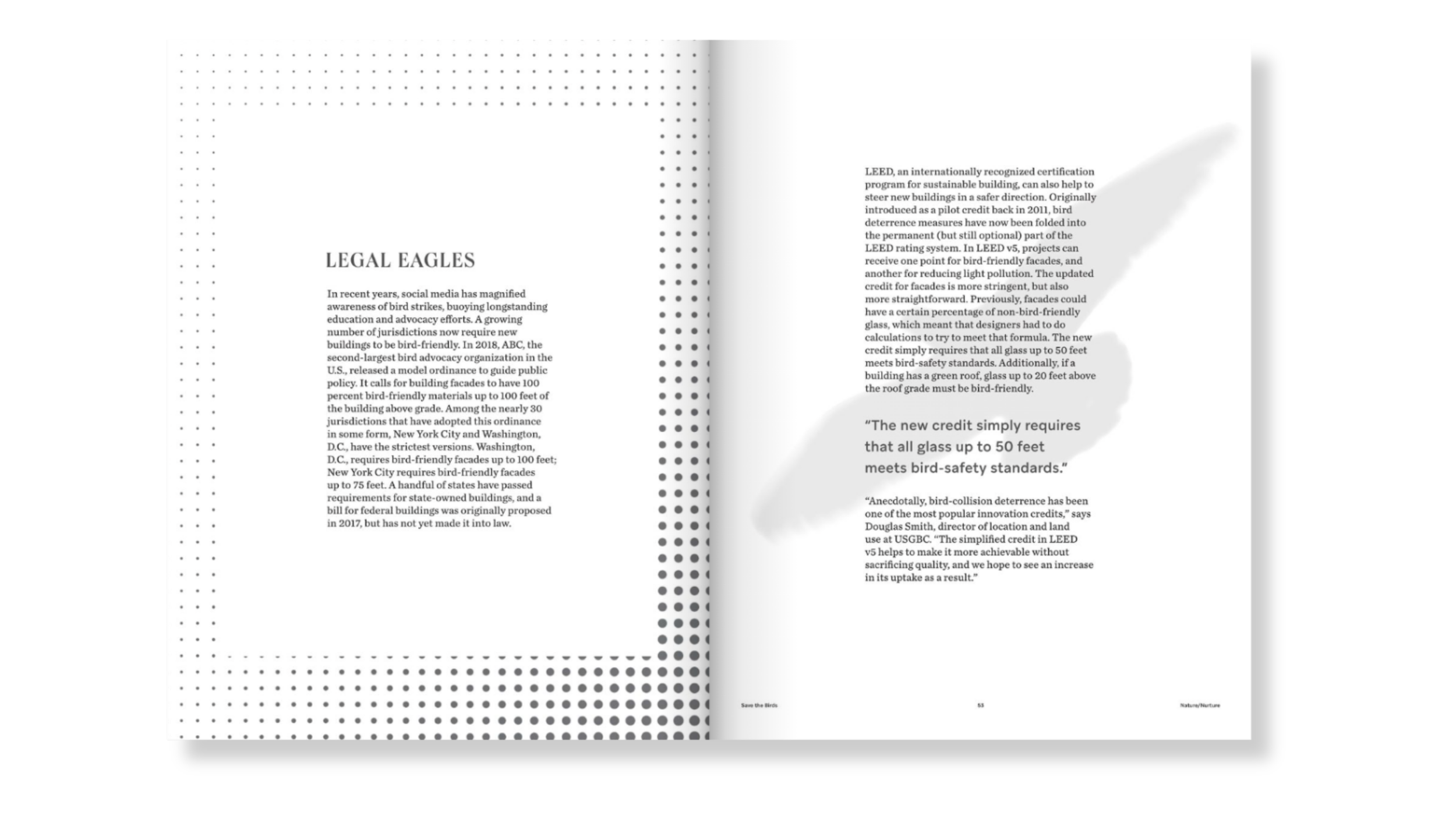
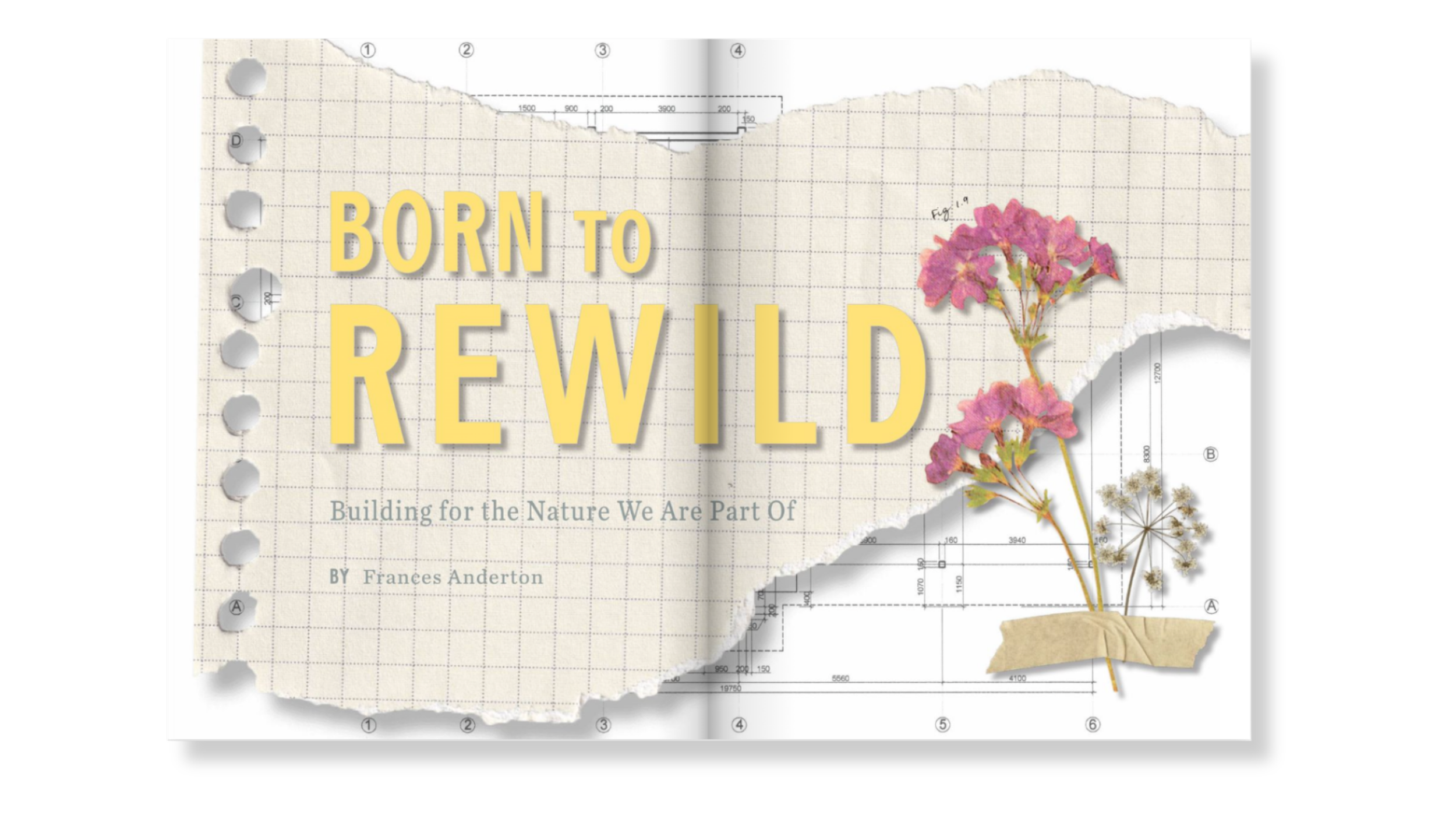
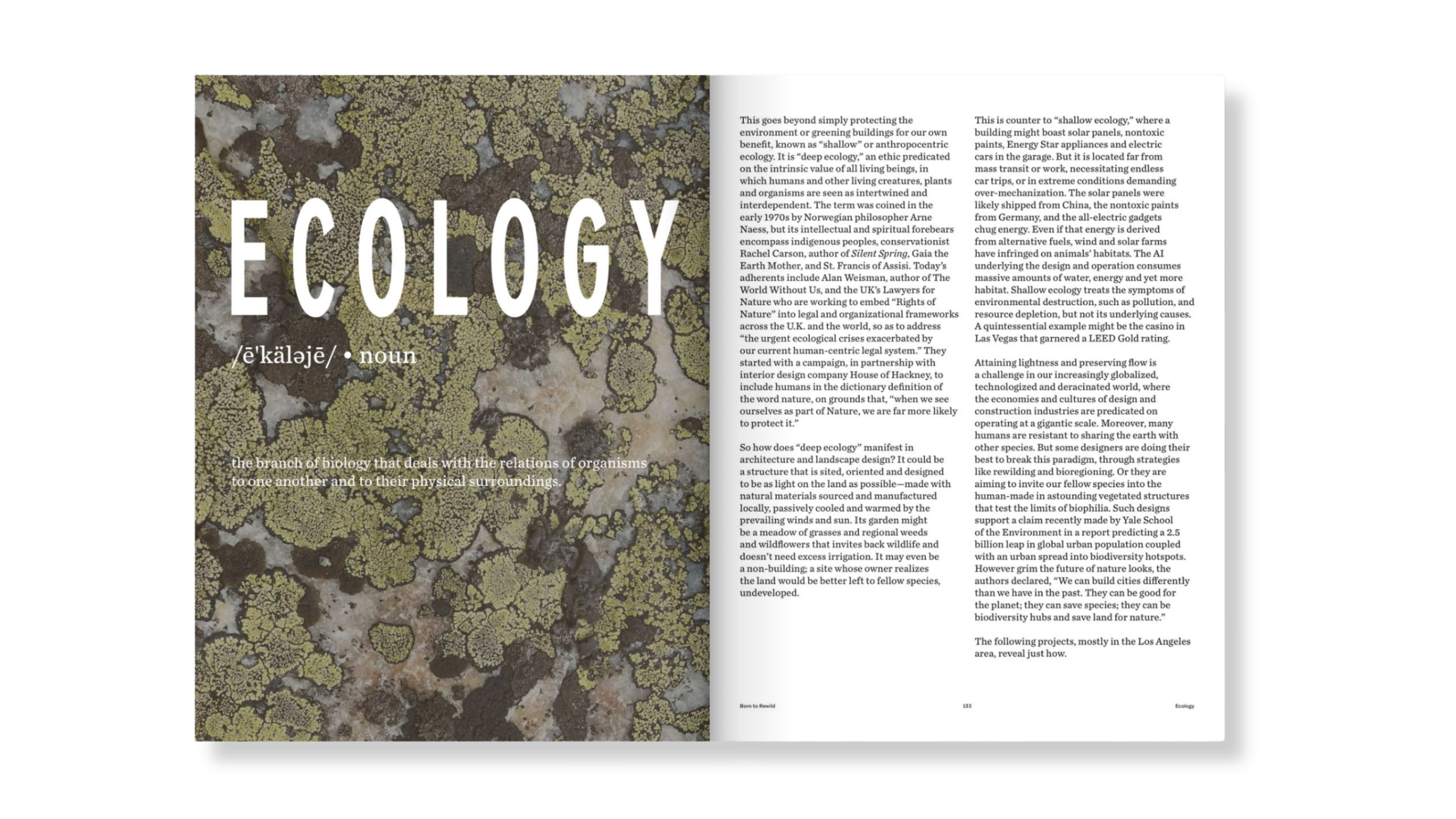
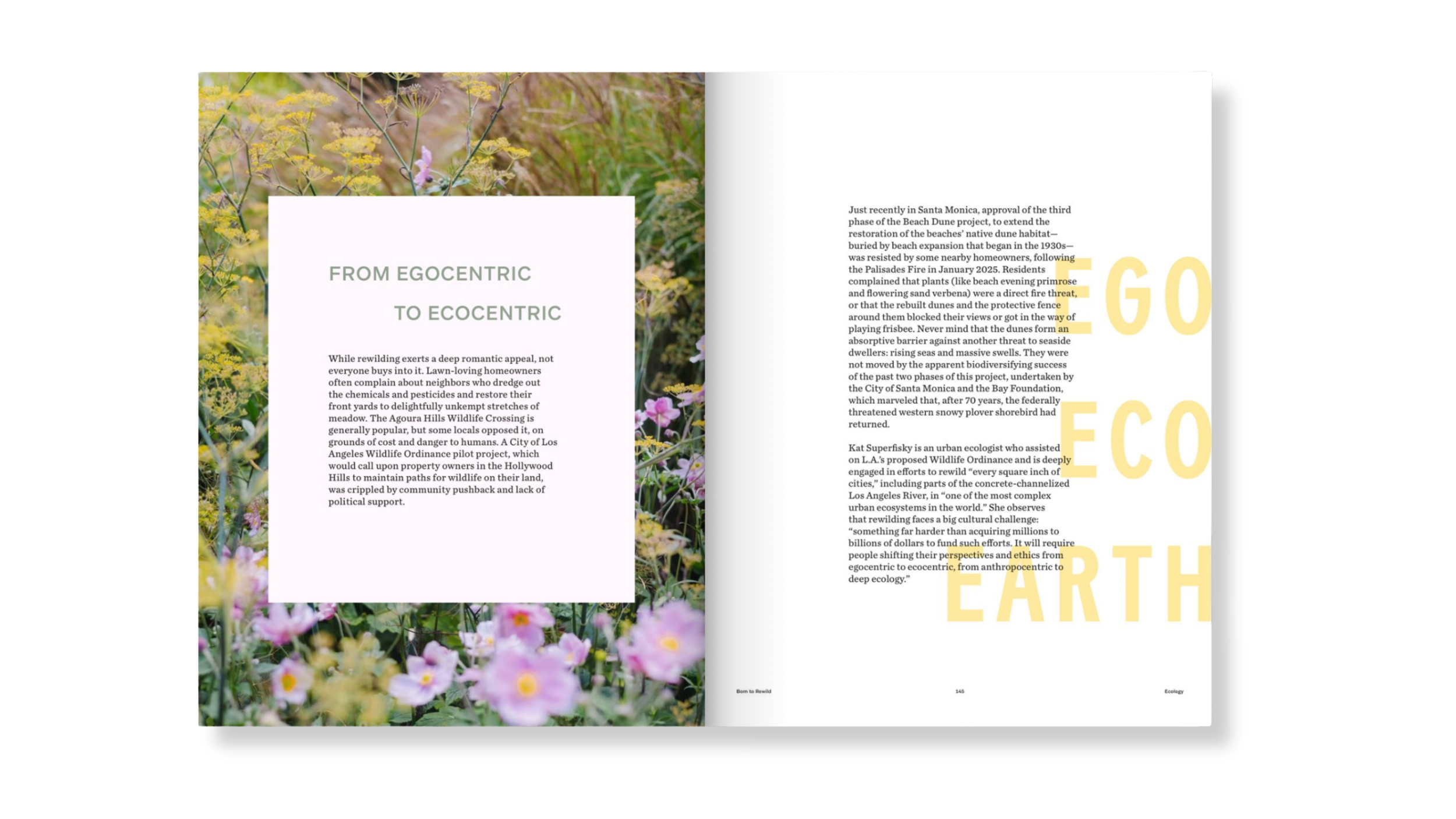
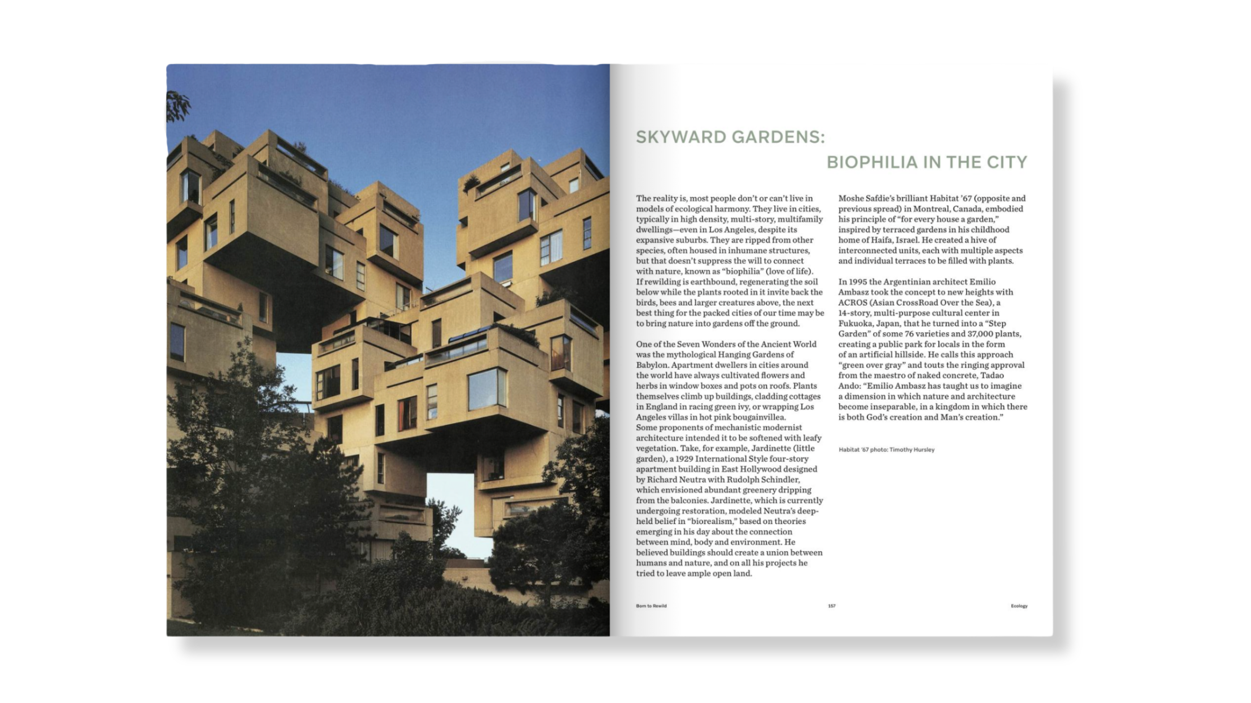
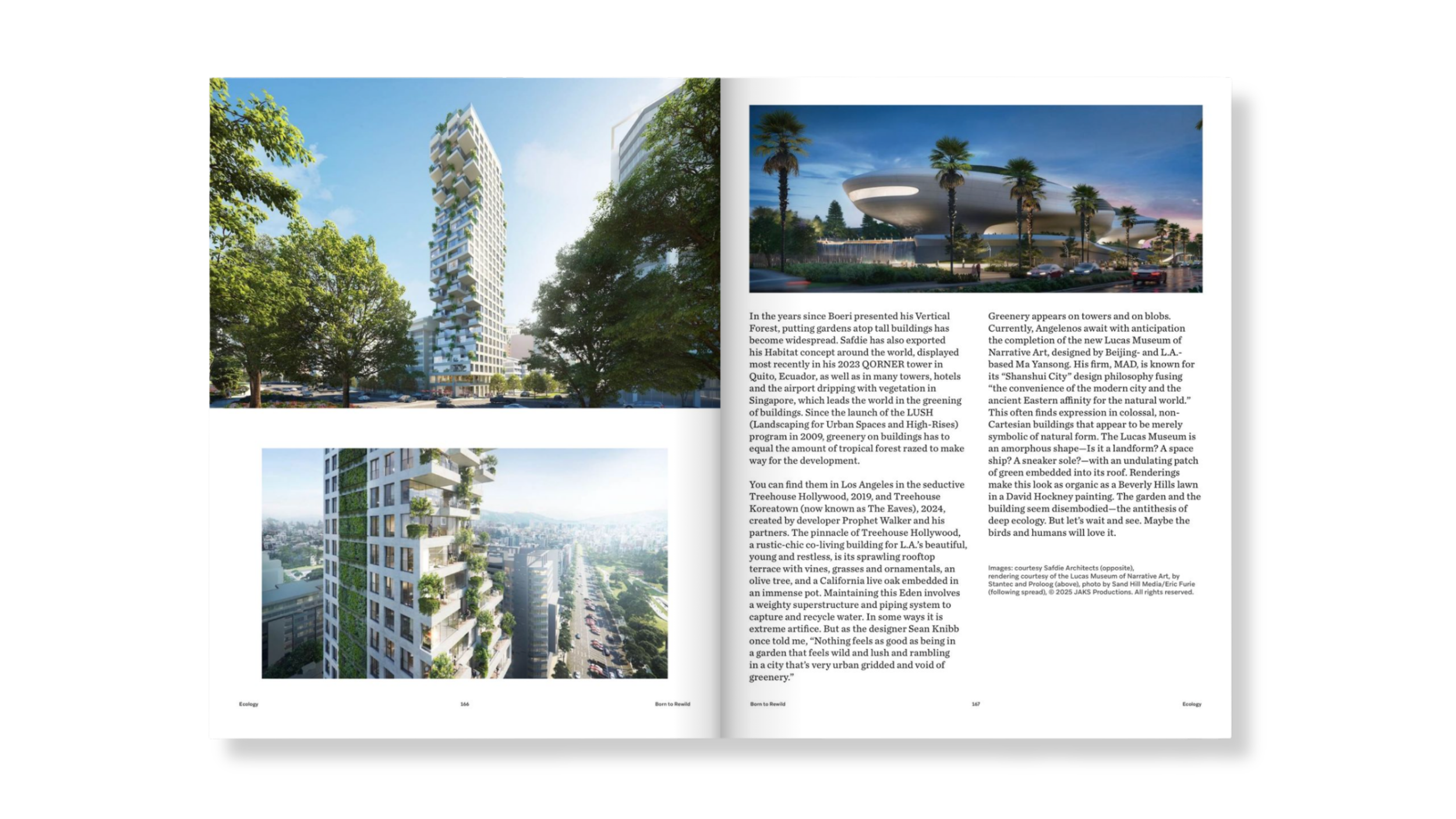
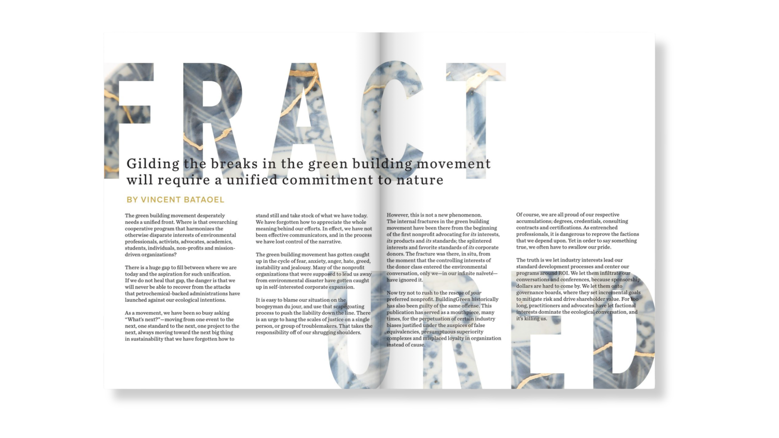
Issue 2 | Deep Ecology
Deep Ecology expanded the visual register of the publication, introducing more layered graphic treatments, darker and more complex colour, and a greater willingness to let imagery dominate the page. The design mirrored the theme's central argument, that nature is not a backdrop but a connected system, dense and interdependent, through compositions that felt more entangled and alive. With the first issue's credibility established, the second could begin to take risks without sacrificing editorial authority.
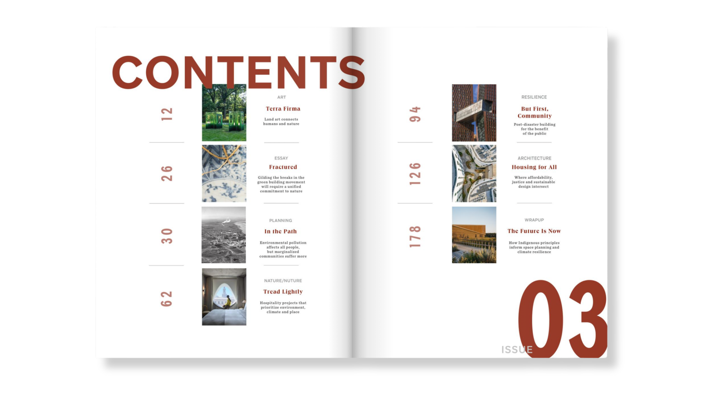
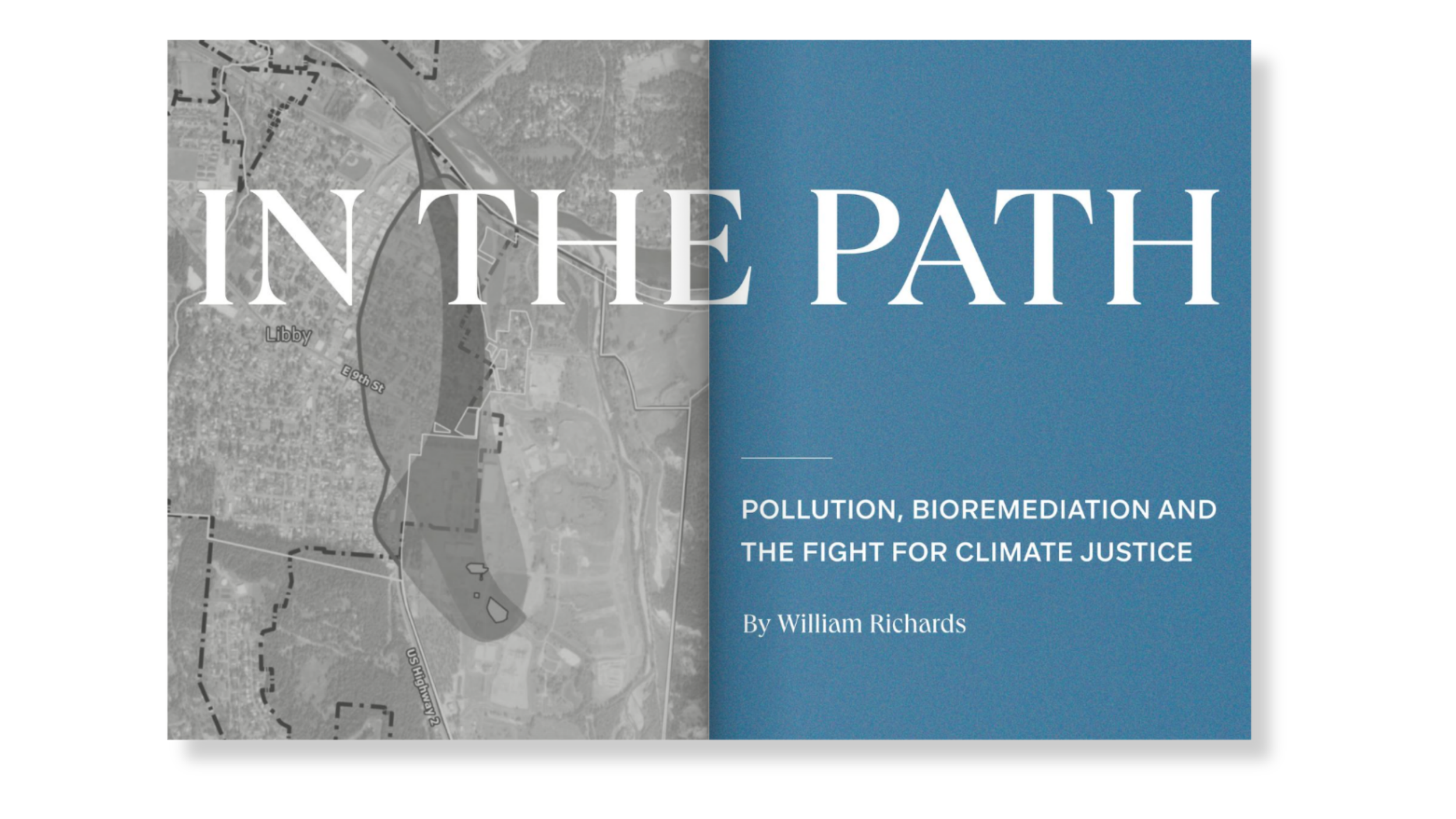
Issue 3 | Climate Justice
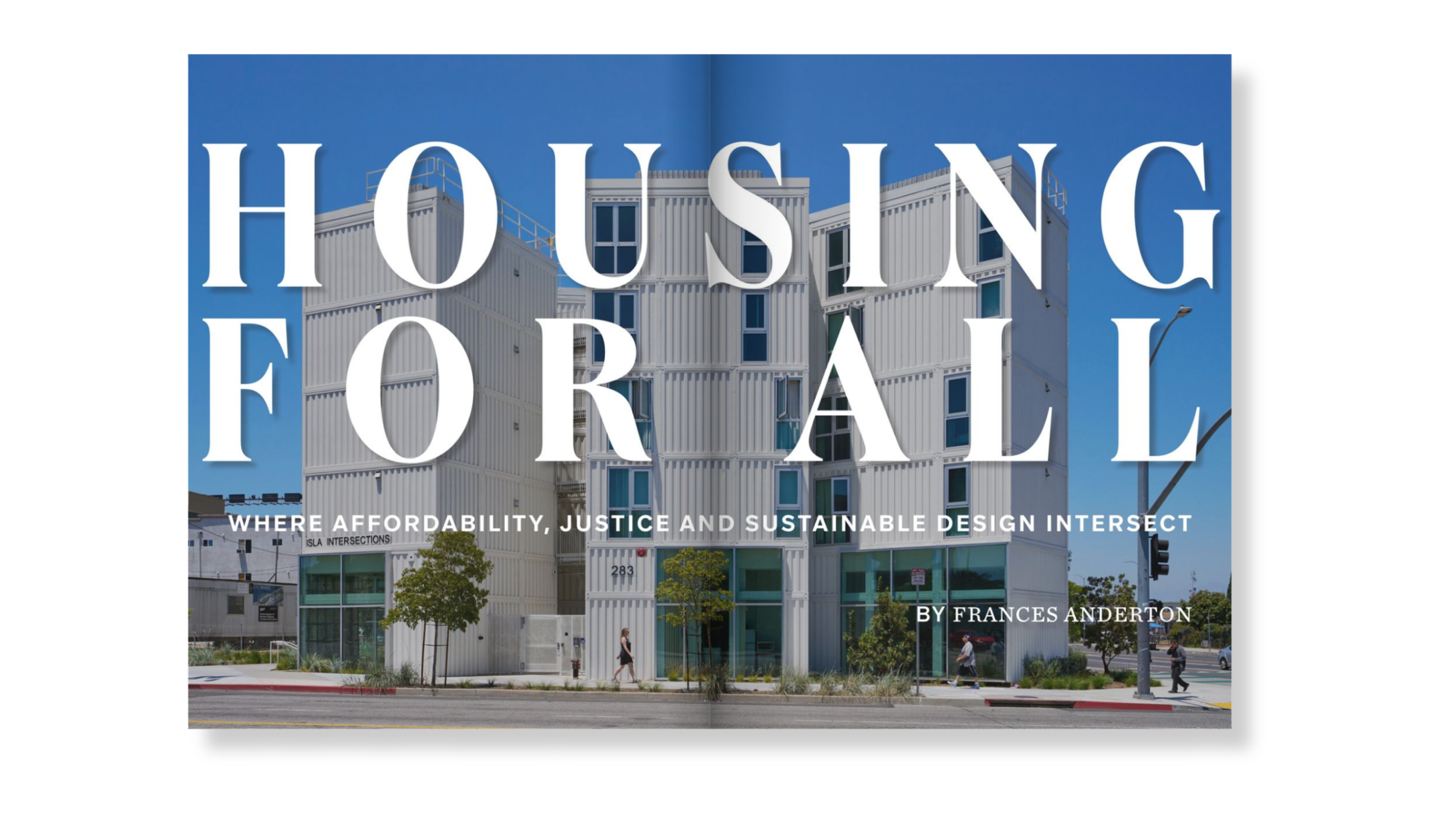
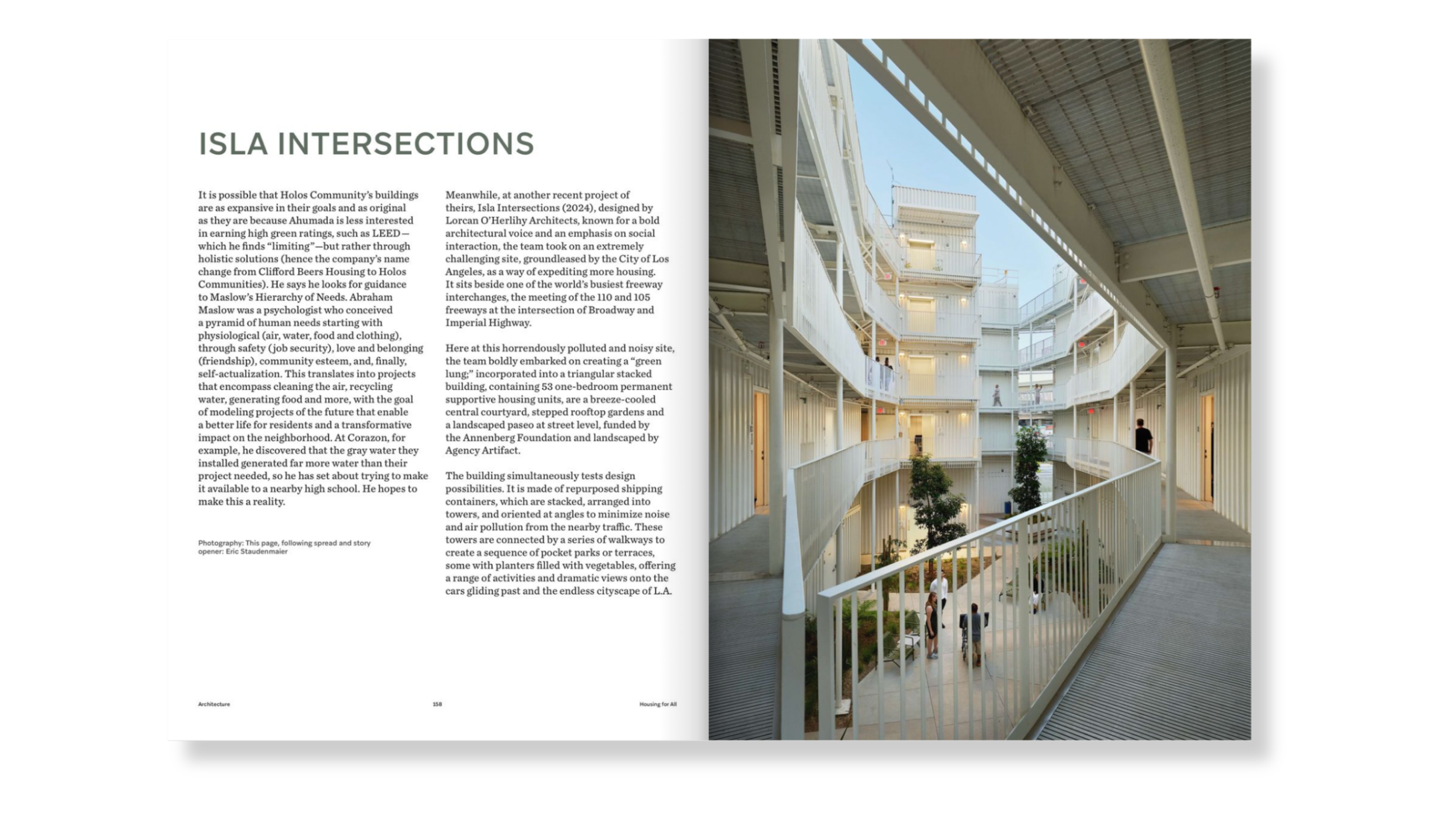
By Climate Justice, the publication had found its confidence. Typography ran large and unapologetic, duotone treatments pushed image into graphic territory and annotations appeared as design elements, grounding abstract political content in specific places and stakes. The theme demanded urgency and precision in equal measure and the design responded accordingly; more directive, charged and unwilling to let the reader settle. The full BuildingGreen identity moved onto the cover, reflecting a publication that now knew what it stood for.

Studio Black Iris’s work across the first three issues established the editorial and visual foundation for BuildingGreen’s new publishing model, shaping a format that could evolve with each theme while remaining recognisably BuildingGreen.
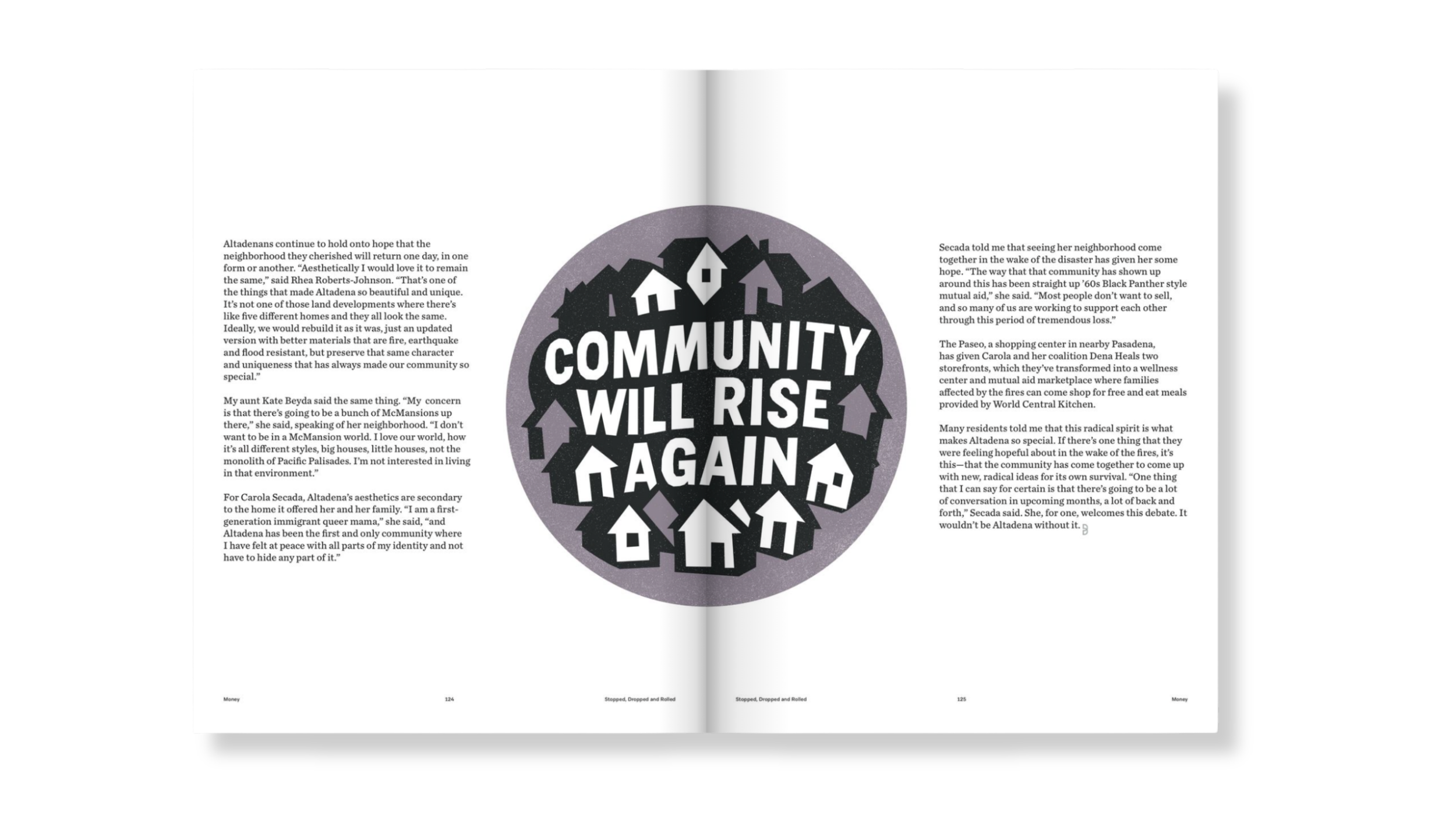
The publication now stands as something distinct within the sustainability space: culturally engaged and built to carry the weight of the conversations it covers.